The Maker’s Guide to Styling Your Products at Home (Without Fancy Gear)
Teaser: A simple, honest guide to styling your products with whatever you already have at home — no studio lights, no fuss, just creative confidence.
Have you ever stood in your kitchen, holding your latest creation in one hand and your phone in the other, wondering why the photo still looks… a bit sad?
I’ve been there too — usually with a cup of cold tea beside me and a strong suspicion that the light was playing tricks.
Styling your own products feels simple in theory — until you’re standing there trying to make it work - makers tell me this all the time in workshops.
Here’s exactly what I teach makers in every workshop: you can create beautiful, scroll-stopping photos at home using natural light, simple props, and a bit of intention.
Let’s break it down.

1. Light first, everything else after
Before you touch a single prop, check your light.
This is where most home shoots go wrong — not because the product isn’t lovely, but because the light is bossy.
My rule?
If the light doesn’t look good to your eyes, it won’t magically improve for the camera.
Try this:
Find the brightest window in your house — usually north- or east-facing.
Turn off every single artificial light. (They fight with daylight and make colours weird.)
Place your product beside the window, not in front of it.
If the sun is too harsh, hang a white curtain or sheet. Instant softbox effect.

Watch how the light wraps around your product. This is your foundation. Everything else builds from here.
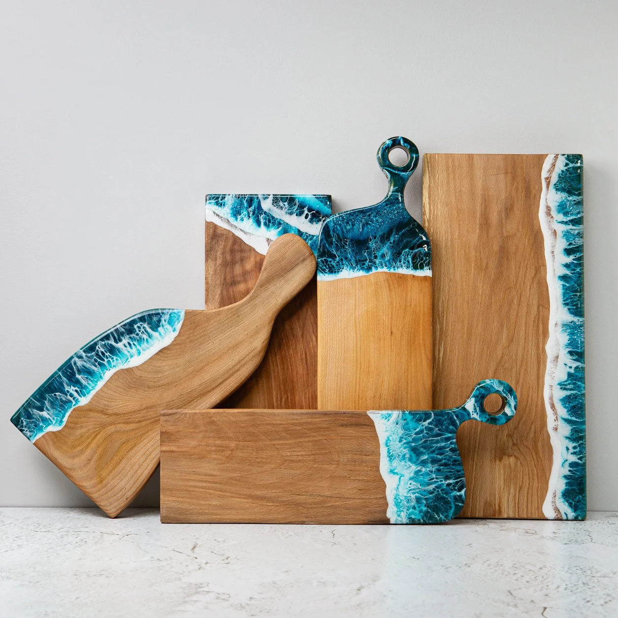
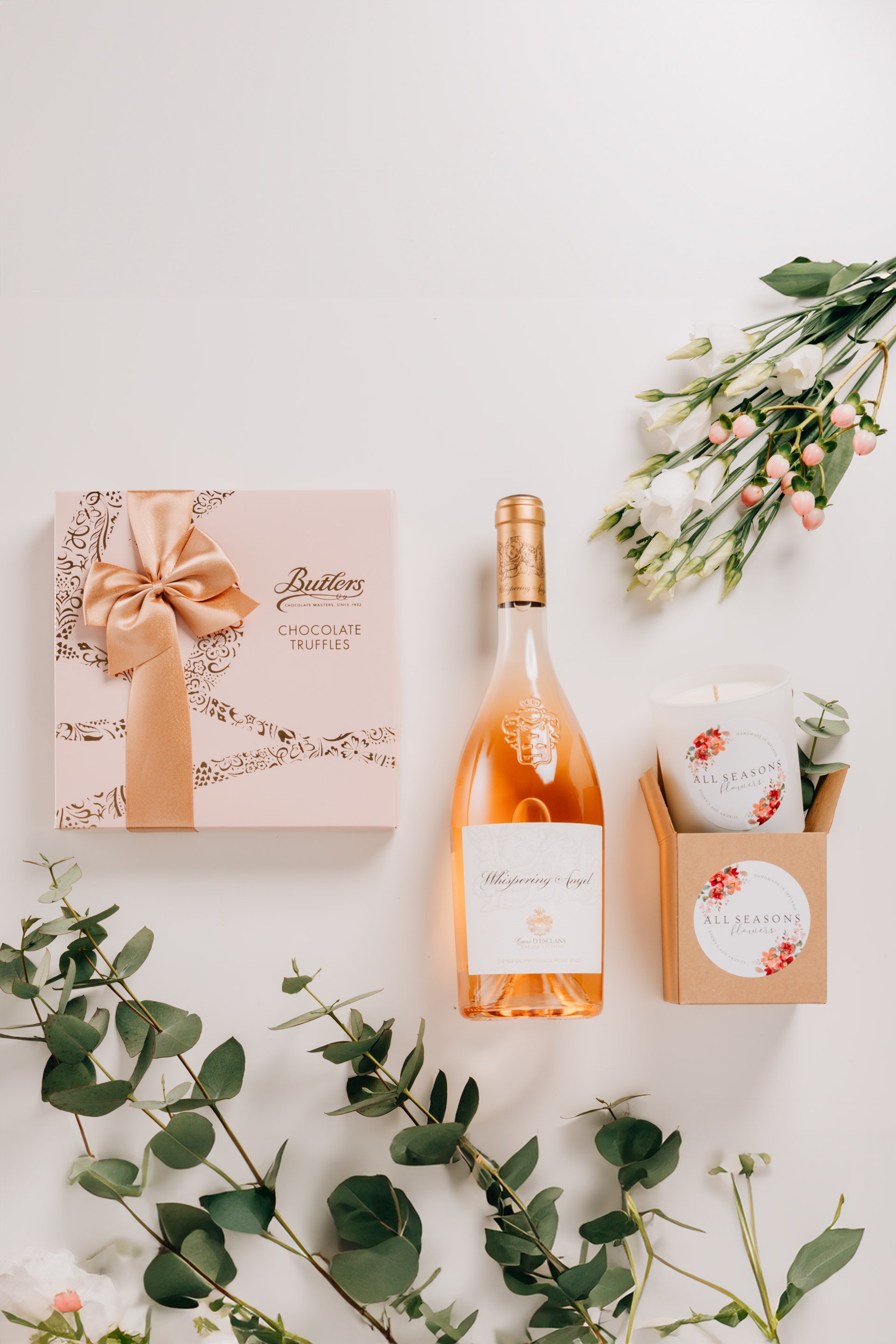
2. Keep props simple and meaningful
The goal is clarity — just enough props to add context, not clutter. It’s tempting to gather every pretty thing from your house and build a scene… but most products don’t need a party.
Some props help. Too many props distract.
Here’s what works at home:
Books (neutral covers, stacked for height)
Linen napkins (soft texture, gentle folds)
Ceramic bowls, plates or trays
A sprig of eucalyptus (always looks classy)
Plain cutting boards or wooden surfaces
Fabric scraps, parchment paper, craft materials

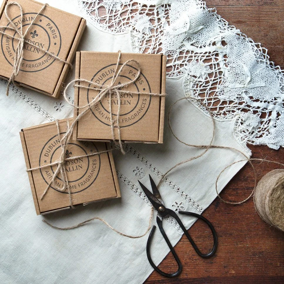
And here’s the trick: choose props that relate to the product.
If the product is delicate, choose soft textures.
If the product is bold, choose clean lines.
If the product is colourful, keep your props neutral.
Think of props as supporting actors — they’re there to lift the star, not steal the scene.
3. Choose Clear, Calm Backgrounds
Let me tell you a secret: when makers ask me why their photos look “messy”, it’s almost always the background.
Not the product. Not the phone. Not the props. The background.
So go for:
neutral tones (grey, beige, off-white, soft pinks are lovely)
matte textures
surfaces without glossy reflections

You can use:
a sheet of card
a painted board
a kitchen tile
a laptop box lid (yes, really — it’s perfect)

Avoid:
creased fabric (it will drive you mad)
shiny trays
busy patterns
coloured walls right behind your setup
Your background should feel like a quiet room: supportive, calm, intentional.
4. Build Your Scene in Layers
Styling goes wrong when everything is placed down at once with no plan. Instead, build your scene step by step:
Background
Product
One prop
Second prop
Adjust light
Small details (ribbons, labels, materials)
IIf something feels off, remove one prop at a time until the scene settles. You’ll feel the moment it clicks.


Here’s a helpful test: Squint at your scene. If you can still tell what the product is, and your eyes aren’t darting everywhere, you’re good.
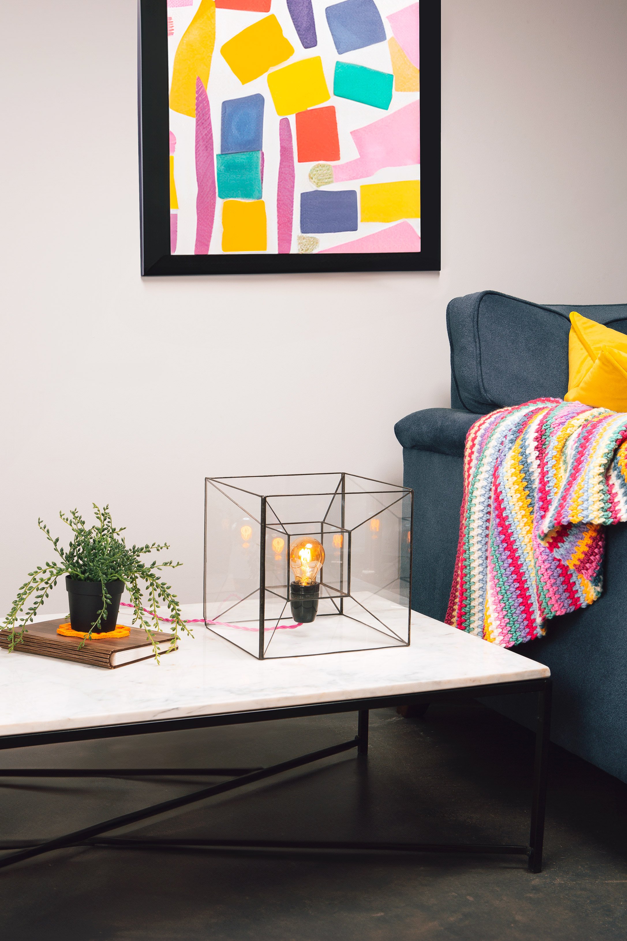
5. Use Negative Space for a Premium Look
This is the design principle nobody teaches makers, but it changes everything.
Negative space is the empty area around your product -it opens up the frame and instantly elevates the look.
Luxury brands rely on it constantly because it creates a sense of calm and quality.
Try leaving:
space above your product
room at the sides
open areas where the light can fall naturally
6. Show Scale Clearly
Customers hate guessing sizes.
So add:
a hand
a tool
a simple object they recognise
your product box or packaging
If you make jewellery, pottery, candles, textiles — anything small and handmade — these subtle, home-friendly props work beautifully.

It’s not just practical — it also adds humanity to your photos, which is something we all need more of online.
7. Take more photos than you think
Every maker I’ve ever met underestimates this part. Take:
straight-on shots
flat-lays
side detail shots
close-ups
back view
shadow-included versions
Then choose the ones that feel like your brand.
8. Edit lightly, not loudly
Overediting is the silent killer of product photos.
Keep it simple:
brighten
adjust white balance
sharpen gently
remove distractions

Avoid:
strong filters
warm colour casts
teal/orange presets
heavy vignettes
Your goal is accuracy.
Key Takeaways
Light first — make it soft, clean, and consistent.
Use props to support, not distract.
Neutral backgrounds always win.
Build scenes slowly, with intention.
Leave negative space for a polished, premium feel.
Show scale — it builds trust.
Take more photos than you need.
Edit gently for natural, true colours.
If this helped, I’d love to see what you create. And if you’re tired of doing it all alone, you know where to find me — we can plan a setup that reflects your craft at its best.
Ana x